Building a SwiftUI Design System in 2025: The Architect's Guide
Published on · 43 min
In 2025, the question is no longer "do we need a Design System?" but "how do we build a Design System that scales?". With the unification of Apple versions (iOS 26, macOS 26, watchOS 26, tvOS 26, visionOS 26), SwiftUI has become the universal foundation for all platforms. A well-architected Design System is no longer a luxury — it's a necessity for any team that wants to deliver consistent, accessible, and maintainable products.
This guide takes you from theory to implementation, with production-ready code.
Why a Design System Has Become Imperative
The Hidden Cost of No System
Without a Design System, here's what inevitably happens:
Visual debt accumulates
- 5 shades of "primary" blue in the app
- Spacing at 12px, 13px, 14px, 16px depending on the mood of the day
- Buttons with 4 different styles for the same action
Accessibility becomes impossible to maintain
- Insufficient contrasts discovered during audits
- VoiceOver reading "button button image"
- Dynamic Type breaking layouts
Multi-platform becomes a nightmare
- Duplicated code between iOS and macOS
- Inconsistent behavior on watchOS
- visionOS added "later" and never properly integrated
The ROI of a Mature Design System
The numbers speak for themselves:
| Metric | Without DS | With Mature DS |
|---|---|---|
Time to create a screen | 2-3 days | 4-8 hours |
UI/UX bugs per sprint | 15-20 | 2-5 |
Developer onboarding time | 2-3 weeks | 3-5 days |
Accessibility coverage | ~40% | 95%+ |
Cross-platform consistency | Low | Excellent |
The 5 Pillars of a Modern SwiftUI Design System
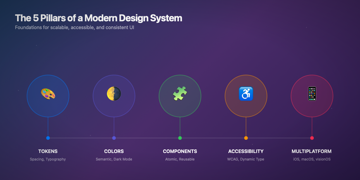
“HIG Reference: Apple structures its guidelines around similar concepts — Foundations (colors, typography, icons), Patterns (navigation, modals), and Components (buttons, controls). A good Design System follows this hierarchy.”
1. Tokens: The Semantic Foundation
Tokens are the atoms of your system. Never hardcode values.
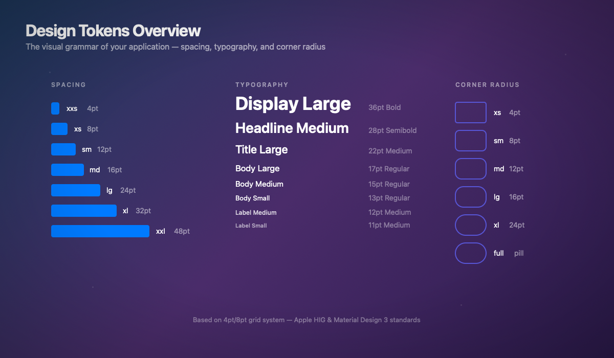
Industry Standards: Spacing
Professional spacing systems follow a 4pt or 8pt scale (also called "4-point grid" or "8-point grid"). This approach is used by:
| System | Base | Scale |
|---|---|---|
Apple HIG | 8pt | 8, 16, 24, 32... |
Material Design 3 | 4pt | 4, 8, 12, 16, 24... |
Atlassian | 8pt | 8, 16, 24, 32... |
IBM Carbon | 8pt | 8, 16, 24, 32, 48... |
“HIG Rule: Apple recommends multiples of 8pt for main spacing, with 4pt for fine adjustments. This ensures pixel-perfect alignment across all screen densities.”
Typography Standards
iOS typography follows the Dynamic Type system with semantic styles:
| HIG Style | Usage | Default Size |
|---|---|---|
Large Title | Page titles | 34pt |
Title 1 | Main sections | 28pt |
Title 2 | Subsections | 22pt |
Title 3 | Groups | 20pt |
Headline | Important labels | 17pt semibold |
Body | Main text | 17pt |
Callout | Secondary text | 16pt |
Footnote | Legal mentions | 13pt |
Caption | Metadata | 12pt |
“HIG Rule: Always use semantic styles (Font.headline, Font.body) rather than fixed sizes. This ensures automatic Dynamic Type support.”
2. Semantic Colors with Native Dark Mode
Never use .red or .blue directly. Always go through semantic colors.
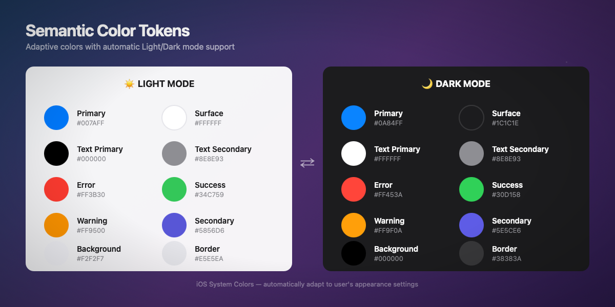
Color Standards: Semantic vs Palette
A mature Design System distinguishes two levels of colors:
1. Palette (primitives) — Raw colors
2. Semantic (tokens) — Usage intent
“HIG Rule: Apple provides system semantic colors (Color.primary, Color.secondary, .background) that automatically adapt to context (light/dark, high contrast). Prefer these before creating custom colors.”
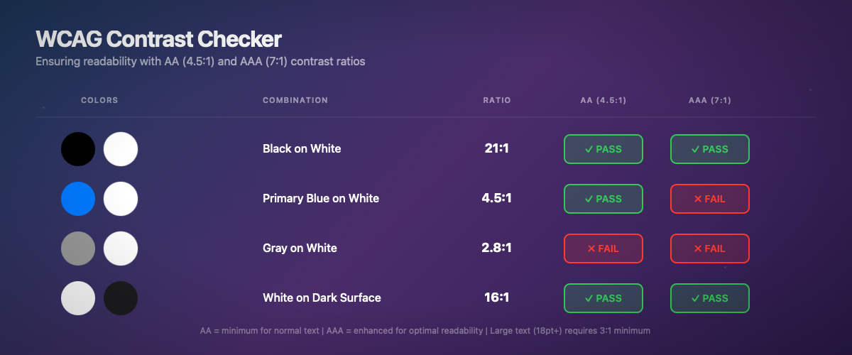
WCAG Contrast Rules
The Web Content Accessibility Guidelines define minimum ratios:
| Level | Minimum Ratio | Usage |
|---|---|---|
AA | 4.5:1 | Normal text (< 18pt) |
AA Large | 3:1 | Large text (≥ 18pt bold or ≥ 24pt) |
AAA | 7:1 | Normal text (recommended) |
AAA Large | 4.5:1 | Large text (recommended) |
⚠️ Legal Standard: In Europe (EAA 2025) and the USA (ADA), WCAG AA level is a legal requirement for public apps. AAA is recommended but not mandatory.
3. Reusable Atomic Components
Each component must be: configurable, accessible, and previewable.
Component Standards: Atomic Design
The Atomic Design methodology (Brad Frost, 2013) structures components into 5 levels:
| Level | Description | SwiftUI Example |
|---|---|---|
Atoms | Indivisible elements | Text, Image, Color |
Molecules | Groups of atoms | DSButton, DSTextField |
Organisms | Complete sections | DSCard, DSNavigationBar |
Templates | Page layouts | DSListTemplate, DSDetailTemplate |
Pages | Instances with data | ProductListView, ProfileView |
“HIG Rule: Apple defines "Controls" (buttons, toggles, sliders) and "Patterns" (navigation, search, modals). A good component respects user-expected behaviors.”
Touch Target Sizes
| Standard | Minimum Size | Recommendation |
|---|---|---|
Apple HIG | 44×44 pt | 44×44 pt minimum |
Material Design | 48×48 dp | 48×48 dp minimum |
WCAG 2.2 | 24×24 CSS px | 44×44 px recommended |
“HIG Rule: All interactive elements must have a tap area of at least 44×44 points, even if the visual element is smaller. Use .contentShape() or padding to enlarge the area.”
4. Complex Components: Card System
Accessibility: Non-Negotiable in 2025
Complete Dynamic Type
Accessible Contrasts and Colors
Accessibility Standards: The 4 POUR Principles
WCAG is based on 4 fundamental principles (POUR acronym):
| Principle | Description | SwiftUI Example |
|---|---|---|
Perceivable | Information must be perceivable | accessibilityLabel(), contrasts |
Operable | Interface must be usable | 44pt touch targets, keyboard navigation |
Understandable | Content must be understandable | Clear labels, explicit error messages |
Robust | Compatible with assistive technologies | VoiceOver, Switch Control |
“HIG Rule: Apple goes beyond WCAG with features like Reduce Motion, Increase Contrast, Bold Text, and Reduce Transparency. A complete Design System must support these preferences.”
Design System Accessibility Checklist
iOS 26: Glass Effect and Material Design
iOS 26 introduces new visual effects with the Liquid Glass paradigm. Here's how to properly integrate them into your Design System.
iOS 26 Standards: Liquid Glass
iOS 26 introduces the Liquid Glass paradigm that unifies aesthetics across all Apple platforms:
| Property | Description | Recommended Value |
|---|---|---|
Blur radius | Background blur | 20-40pt depending on context |
Saturation | Color vibrance | 1.2-1.5× |
Luminosity | Brightness adjustment | ±10-20% depending on light/dark |
Border | Subtle border | 0.5pt semi-transparent white |
“HIG iOS 26 Rule: The glass effect should be used sparingly — primarily on navigation bars, sheets, and overlays. Avoid it on main content to maintain readability.”
When to Use Glass vs Solid
| Context | Recommendation |
|---|---|
Navigation bars | ✅ Glass (ultraThinMaterial) |
Tab bars | ✅ Glass (thinMaterial) |
Sheets/Modals | ✅ Glass (regularMaterial) |
Cards on solid background | ❌ Solid (elevated surface) |
Cards on image | ✅ Glass (for readability) |
Main content | ❌ Solid (never glass) |
Swift 6: Concurrency-Safe Design System
Swift 6 enforces concurrency safety. Your Design System must be ready.
Modular Architecture: Swift Package
Structure your Design System as a Swift package for maximum reusability.
Multi-Platform: One Codebase, All Platforms
HIG Rules by Platform
Each Apple platform has its specifics that your Design System must respect:
| Platform | Particularity | Required Adaptation |
|---|---|---|
iOS | Touch-first, 44pt targets | Large buttons, swipe gestures |
iPadOS | Pointer support, multitasking | Hover states, sidebars |
macOS | Precision cursor, menus | Smaller buttons, keyboard shortcuts |
watchOS | Minimal screen, glances | Compact components, Digital Crown |
tvOS | Focus-based, remote control | Visible focus states, directional navigation |
visionOS | Spatial, eye-tracking | Z-depth, spatial hover effects |
“HIG Rule: A good Design System doesn't force absolute uniformity — it adapts visual expression to each platform's interaction paradigm while maintaining brand identity.”
Automated Design System Testing
Design System Governance
The Design-Dev-Product Triangle
A successful Design System requires alignment of three parties:
| Role | Responsibility | Deliverable |
|---|---|---|
Design | Define visual guidelines | Figma components, specs |
Dev | Implement components | Swift Package, tests |
Product | Prioritize and adopt | DS roadmap, metrics |
Semantic Versioning
Your Design System must follow Semantic Versioning (SemVer):
Documentation as Code
Each component must include:
- Description — What the component does
- Usage — Code examples
- Props/API — Available parameters
- Variants — States and variations
- Accessibility — VoiceOver behavior
- HIG Reference — Link to Apple guideline
- Do/Don't — Good and bad practices
“Industry Standard: Mature Design Systems (Shopify Polaris, Atlassian, IBM Carbon) publish web documentation with interactive playgrounds. For SwiftUI, use DocC + Swift Playgrounds.”
Going Further
Official Apple Documentation
Essential WWDC Sessions
WWDC 2024: "Design for visionOS" — Multi-platform patterns
WWDC 2023: "Build accessible apps with SwiftUI" — Advanced accessibility
WWDC 2023: "Discover Observation in SwiftUI" — Modern state management
WWDC 2022: "The SwiftUI cookbook for navigation" — Navigation architecture
Community Resources
Design+Code — SwiftUI and Design courses
Mobbin — Mobile UI/UX inspiration
Apple Design Resources — Official templates
A Design System is not a one-time project — it's a living product that evolves with your needs. Investing in this foundation in 2025 will save you months of development and ensure a consistent user experience across all Apple platforms.
In an upcoming article, we'll see how to automate documentation and validation of your Design System with CI/CD pipelines.